Penzeys Spices
Penzeys Spices is a beloved spice retailer, known for their blends and wide selection. However, a narrow navigation structure and unclear navigation hierarchy makes browsing and discovering their 293 spice products difficult.
Context
Penzeys Spices is a family-owned, independent spice retailer with a robust website and 70 brick and mortar locations across the country. They source, grind, blend, package, and ship all of their own products from their headquarters in Wauwatosa, WI. Since their founding in 1986, they pride themselves on being rooted in the communities they serve.
Problem
- The site structure does not support browsing and discovering new spices
- While search presented several Mexican spices, the search results do not represent the company’s complete offerings in that product area
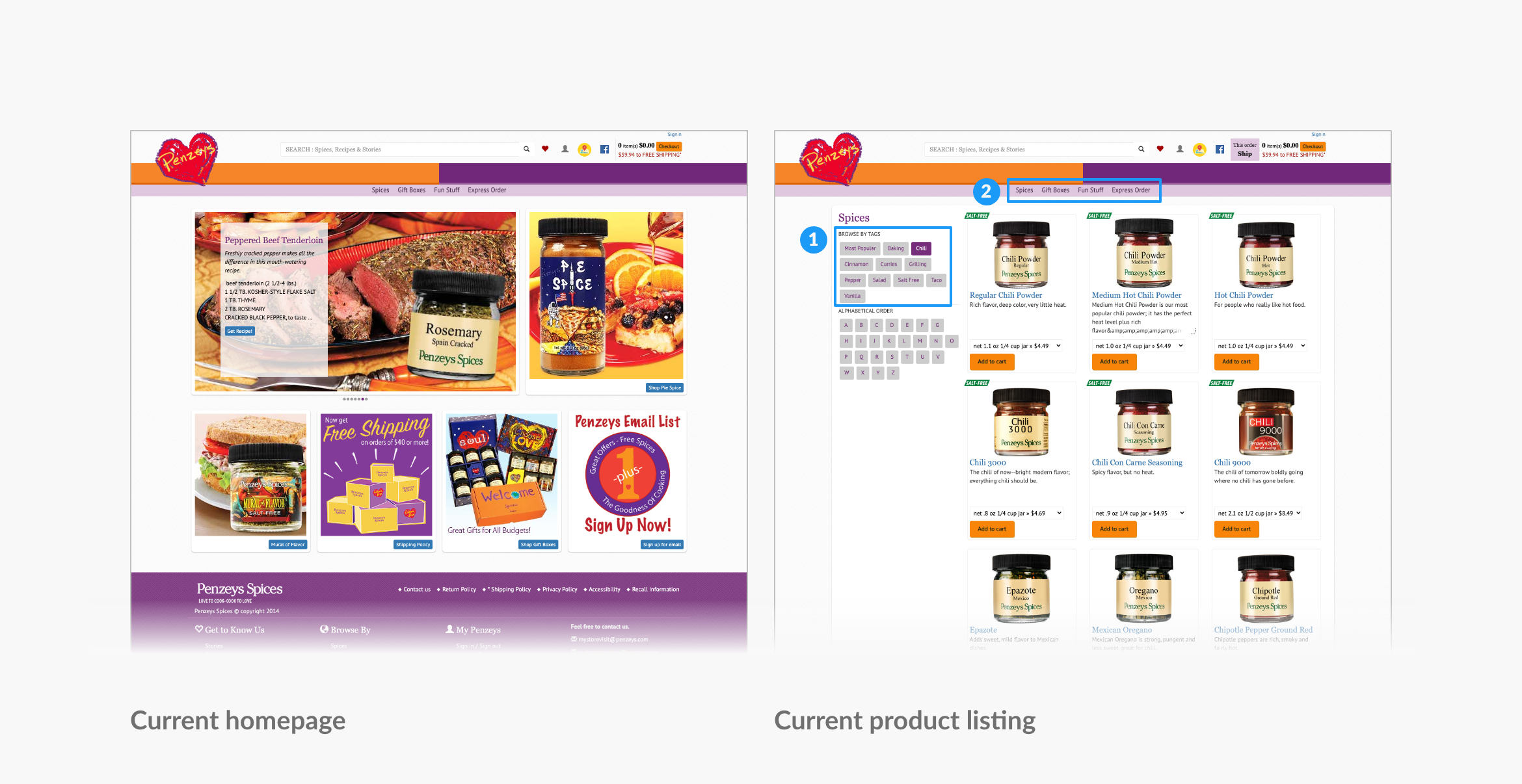
- “Browse by tags” in the left column matches the user’s filtering mental model; however, they function like secondary navigation (see 1)
- The primary navigation doesn’t stand out in the page hierarchy (see 2)
My Role
Sole information architect, user researcher, UX designer
Methods
Card sort, information architecture, wireframing, prototyping
Client
Student project not affiliated with Penzeys, completed as part of my graduate studies at Bentley University
Solution
Organize content to match a user's mental model and provide education through structure and content.
Process
Document the Current State
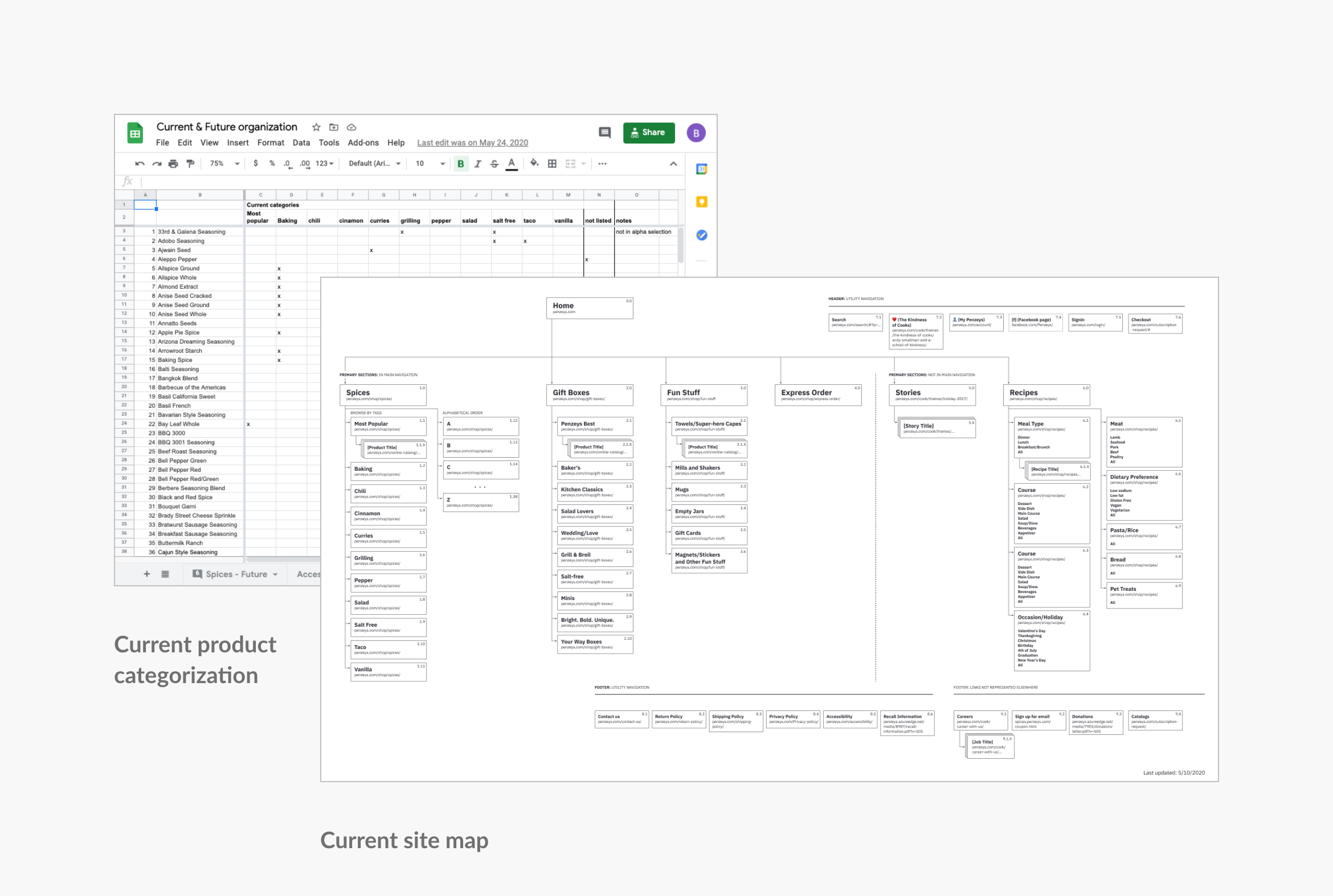
Research: Open Card Sort
In order to understand how users organize and categorize spices, I conducted an open card sort with 29 Participants. They were asked to sort 50 spices (chosen at random from 138 total spices) into categories in a way that made sense to them, and name those groups accordingly.
Findings
all
participants used “herb” as a category label
18
participants created a “Baking,” “Baking Spices,” or related category
17
participants grouped spices by region or ethnicity
19
users expressed difficulty in categorizing unfamiliar items
50%
of the times presented, “Allspice” was miscategorized as a mixed spice or blend
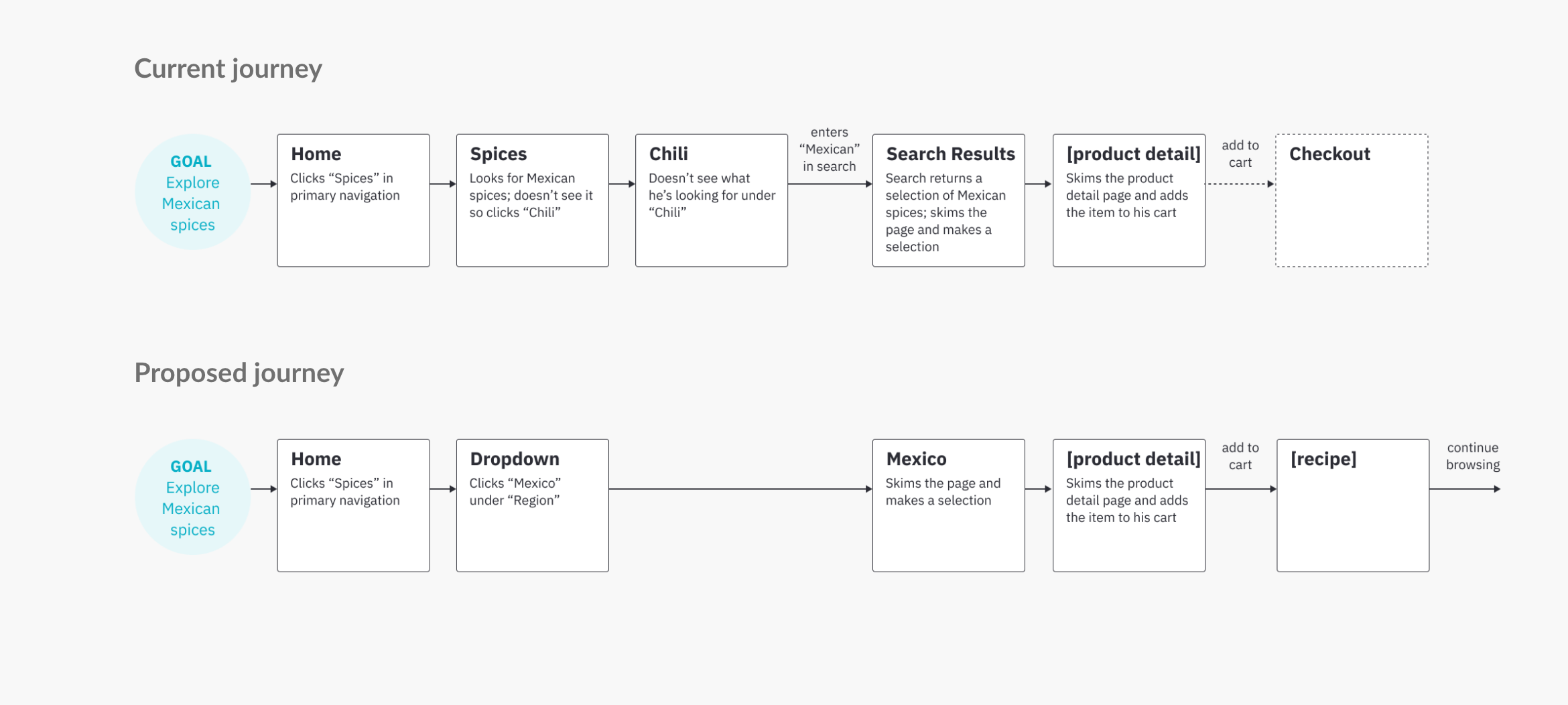
Sample Task & User Journey
A father would like to try replicating several of his family’s favorite dishes from their local Mexican restaurant. After looking through recipes, he realizes that he’s missing several common Mexican spices. He’s already running low on his favorite chili powder from Penzeys, so he’s planning to do a big order.
Task
Explore Mexican Spices
User Journey
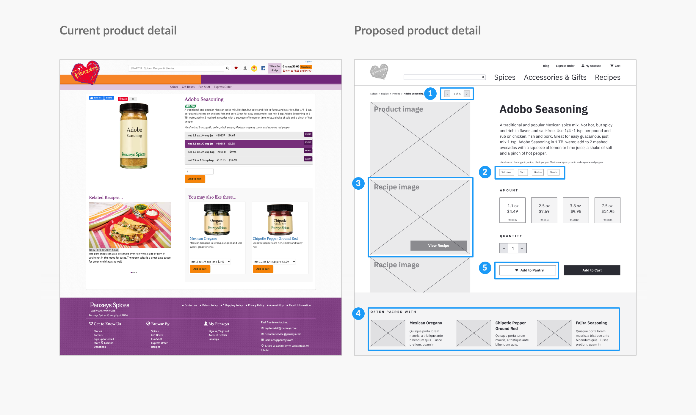
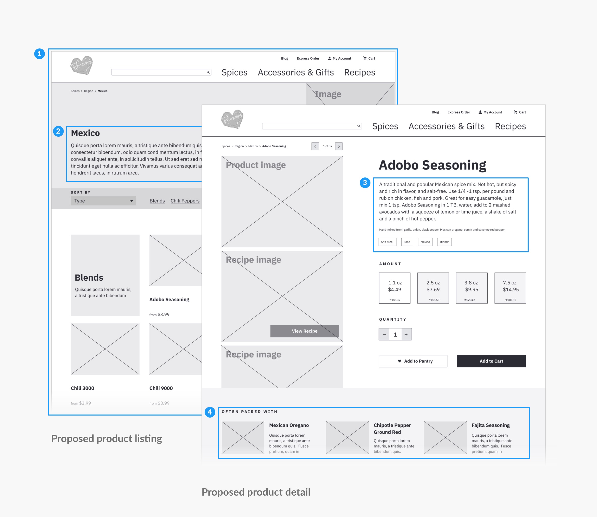
Final Design: Key Decisions
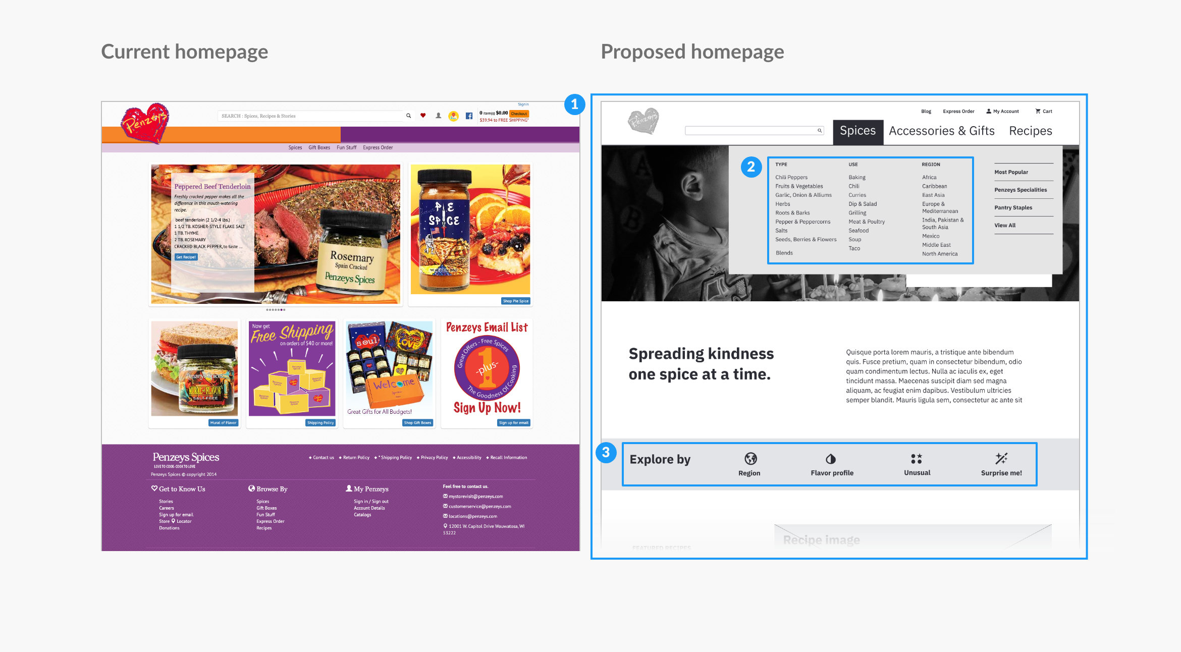
Promote Browsing and Exploration
On the homepage:
- Created a clear page hierarchy
- Informed by card sort results, broke the 293 spice products into 3 top level with 29 sub-categories. (Current site contains 11 categories, the largest contains 56 items.)
- Provided direct invitations to explore and strategically placing related content
Site structure promotes browsing and exploration by additional associative navigation and more emphasis on associative navigation on the product detail page:
- Allowed flipping through search results from previous page
- Included links to related content
- Emphasized related recipes
- Emphasized related products
- Added an “Add to Pantry” feature to allow users to save favorite products and make reordering easier
Provide Education Through Structure and Content
I incorporated education into the redesigned structure through:
- Landing page dedicated to products in this category
- Overview of the flavors of Mexico
- Product description
- Related products
Results & Next Steps
Through the restructuring of Penzeys' information architecture, I developed a more intuitive structure that promotes education, browsing, and exploration. With these changes, users of the Penzeys website now have an experience that allows them to find spices that fit their needs and goals.
To continue this project, some next steps would include:
- Closed card sort to build on findings from open card sort
- Build out additional wireframes for the rest of the page types
- User testing to uncover usability issues in proposed redesign and understand if improvements accomplish goals as expected
Header image
SKopp on Wikimedia Commons
More projects

Massachusetts Health Connector Redesign Interaction Design

Remote Court Proceedings ExperienceField Research & Service Design
Mapping the Workers' Compensation JourneyJourney Mapping
Mass.gov/courts Usability StudyUsability Testing
It's Our Call Interaction Design
Boston CreatesBrand Strategy & Design
4th Avenue, BrooklynPlace Making & Enviormental Design
Williams College Capital CampaignDigital Strategy & Design
TrusteesBrand Strategy & Design
Collective GoodsBrand Strategy & Design

Roasting PlantBrand Strategy & Design

Boston Architectural College, ScreenDigital Strategy & Design

Boston Architectural College, PrintBrand Strategy & Design
WindhoverPrint Design
© 2021 Rebecca Mayfield. All rights reserved.