Massachusetts Health Connector Redesign
Shopping for health insurance is a daunting, stressful proposition, particularly for a novice user. The current Massachusetts Health Connector marketplace is overwhelming, confusing, and not aligned with a user's goals.
Problem
Health insurance ensures that a person is financially protected against future costs for medical treatment. The state of Massachusetts requires all residents to carry health insurance or otherwise face a tax penalty. To facilitate and standardize the purchase of insurance, the state operates the Health Connector marketplace. However, the current Massachusetts Health Connector marketplace doesn't provide adequate decision-making support.
My Role
Sole user researcher, UX designer, UI designer
Methods
Literature review, information architecture, user research, domain research, UX design, UI design, prototyping
Client
Student project, completed as part of my graduate studies at Bentley University
Solution
By streamlining the task flow, incorporating education, and only displaying relevant insurance plans, a novice user is better informed about their options and is more likely to complete their purchase.
Process
Research
Literature review: Purchasers have limited health insurance literacy. For example, half of consumers that claim confidence in choosing a health insurance plan could not differentiate between an HMO and PPO. Additionally, in the similarly complex decision of choosing a 401k plan, for every ten funds added to the list of available funds, participation decreased by 2%. If too many options are presented, users are more likely to delay choosing or entirely opt out of making a choice.
User: I interviewed five recent marketplace users about their understanding of health insurance and pain points. Key findings included confusion around basic concepts like deductibles and cost sharing, frustration with extraneous information, and feeling overwhelmed. Three users explicitly wondered if the "metal tier" (bronze, silver, gold, platinum) organization is meaningful, and two users admitted that they gave up and went with the same plan they had last year.
Competition and domain: I dug into the insurance domain and the financial aspects. I looked into the history of the Affordable Care Act, the design of other insurance marketplaces, and educated myself on basic insurance concepts. Admittedly, prior to this project I didn't understand how cost-sharing works, and I didn't fully research my own decision when I purchased health insurance.
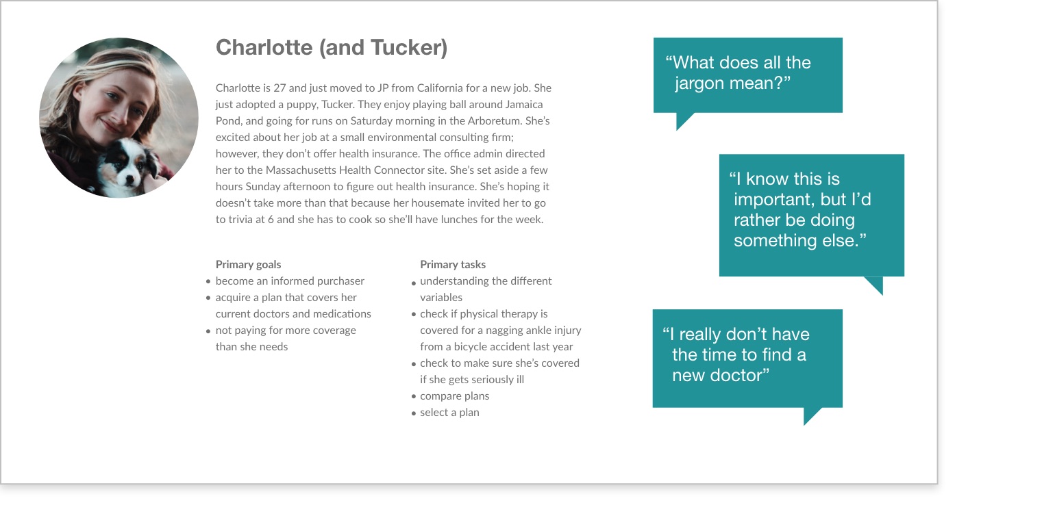
Persona
To keep the project scope manageable, I focused on the experience of a user who has never purchased health insurance before. I developed a persona informed by the themes uncovered in my research.
Iterations
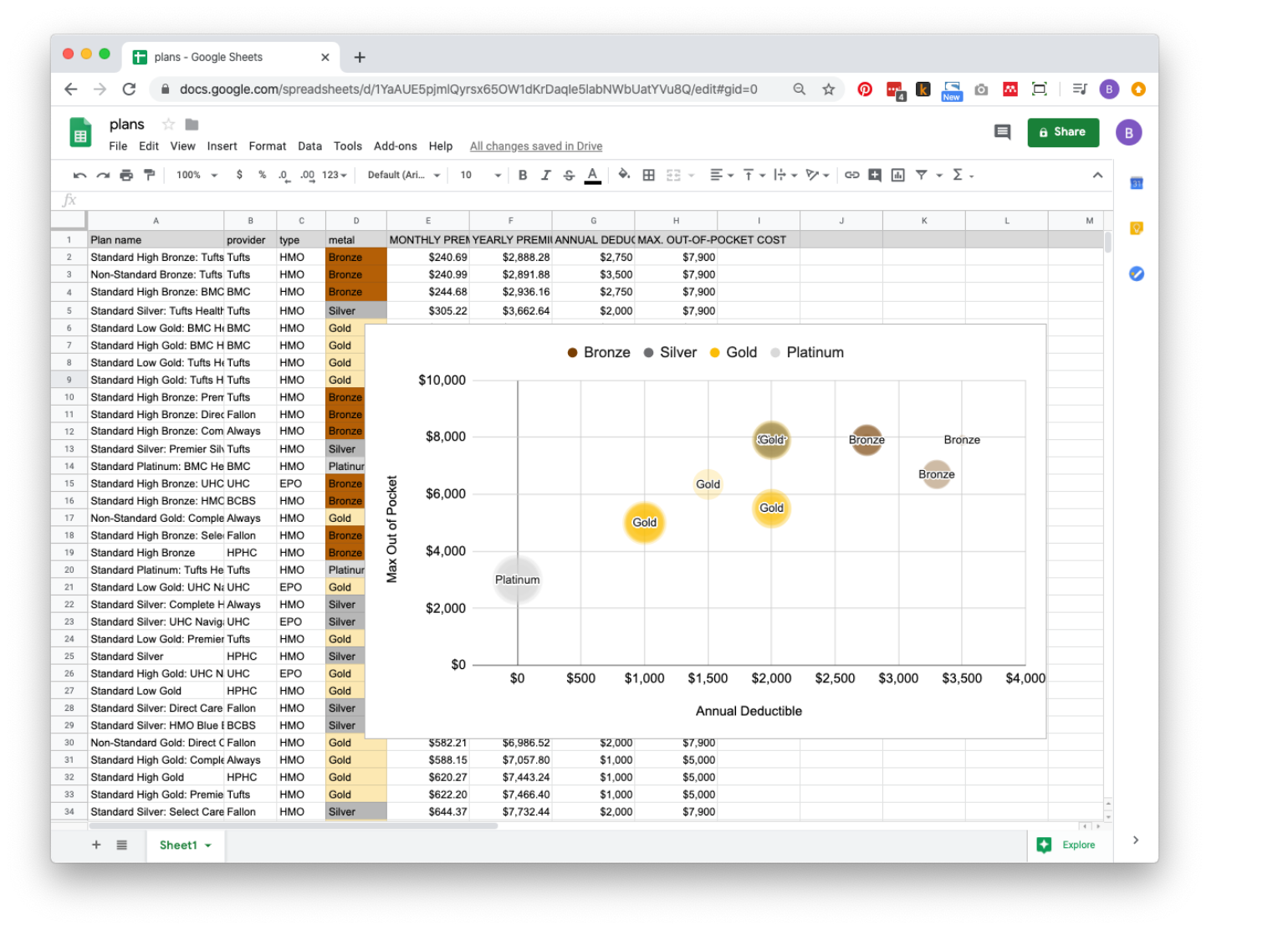
Role of metal tiers: Health plans are rated by metal tier, though what the tier criteria are isn’t conveniently explained. Presumably, a platinum plan has better coverage and is more expensive than a gold plan. I was curious whether there’s a meaningful difference between metal tiers, so I mapped them on a spreadsheet. The short answer is, no. Notably, several silver and bronze plans had similar costs and coverage. With this finding, I emphasized other decision-making criteria and minimized metal tiers.
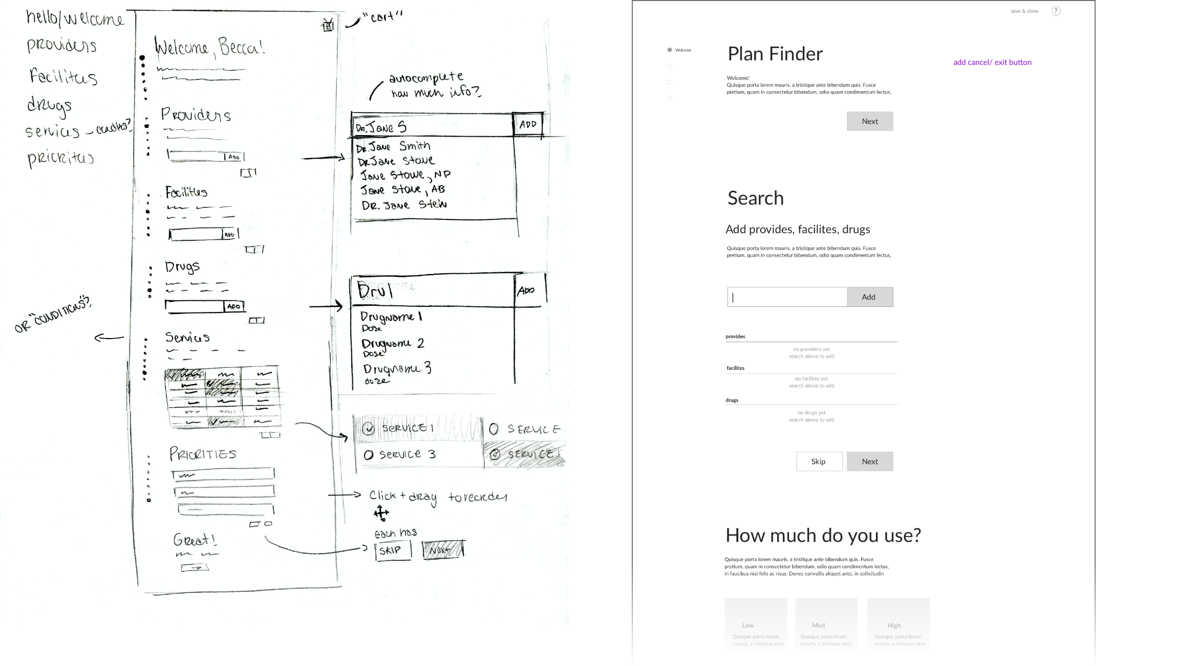
Page structure: In these sketches, I explored the amount of content and the tradeoffs of one long scrolling page vs. individual pages for the plan selection wizard. It also shows the evolution of the provider and facility search feature.
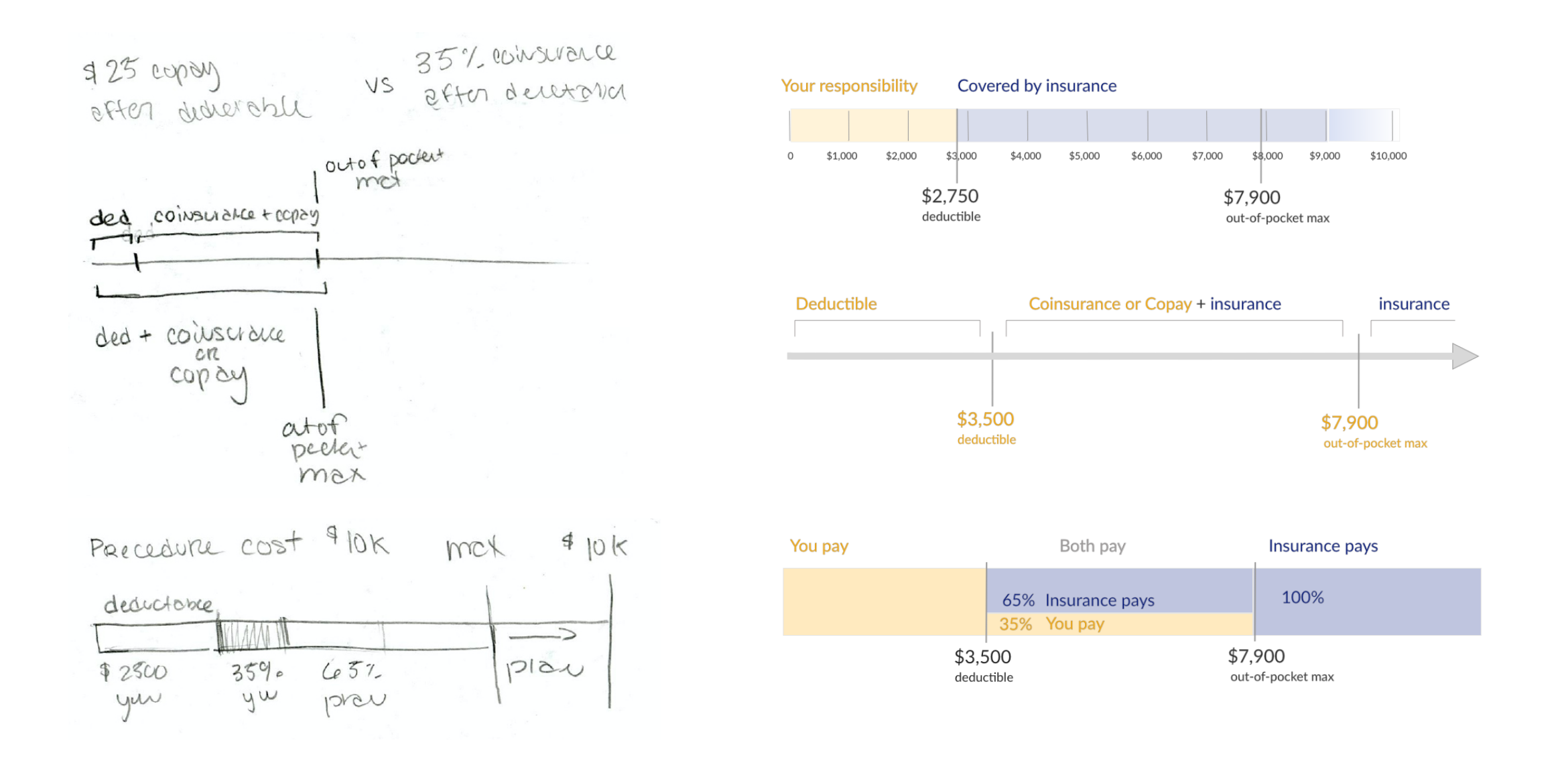
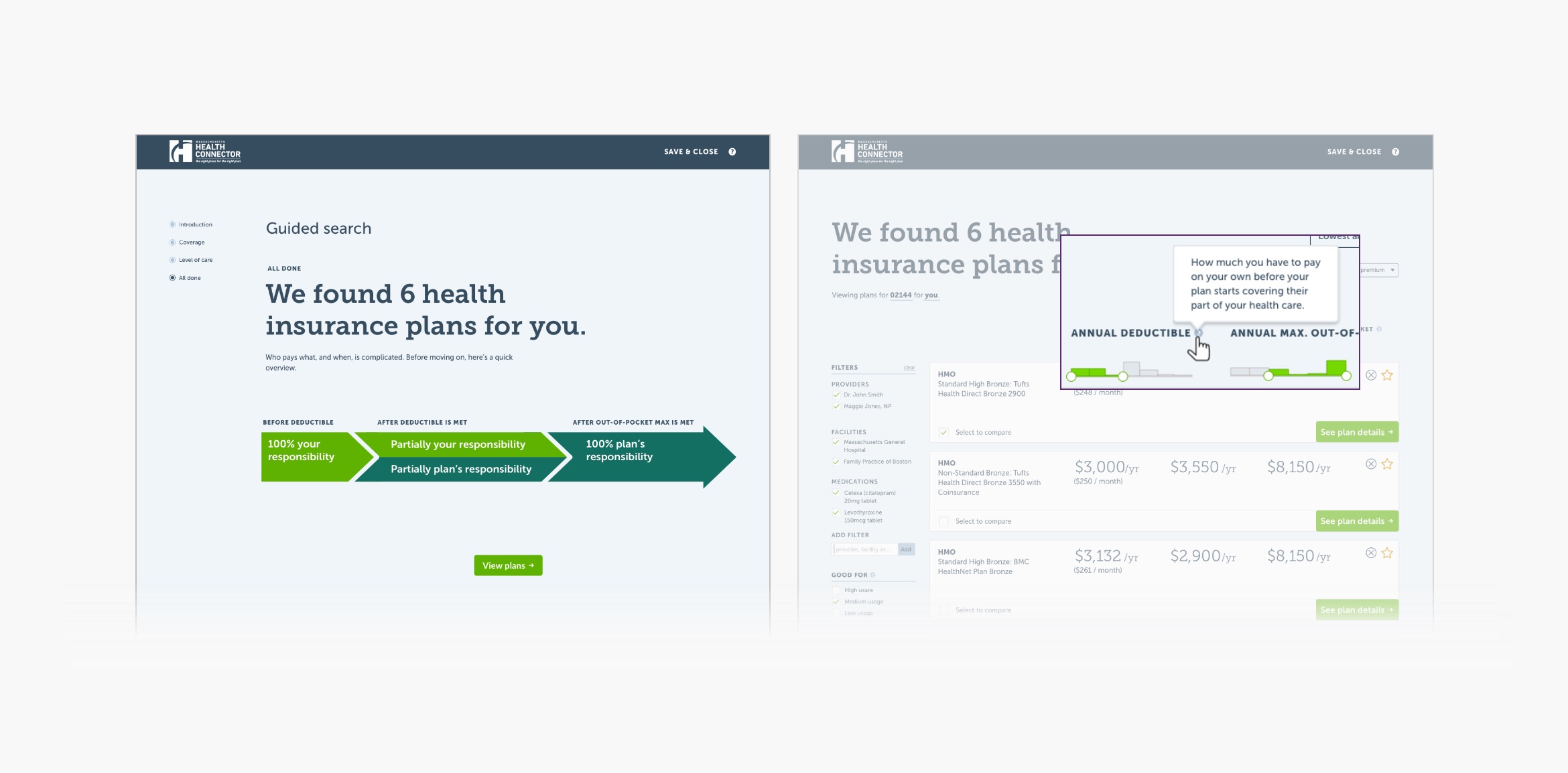
Cost sharing: From my research, I learned that most people don’t understand how cost sharing works. Below are several of my sketches exploring how to visualize the concept. Because of the inherent structure of our health insurance system, it’s almost impossible to predict costs ahead of time. Each insurance company negotiates different rates with each provider, there’s no standardization in how much providers charge, and there are many other complicating factors. Therefore, it’s not realistic to incorporate actual numbers.
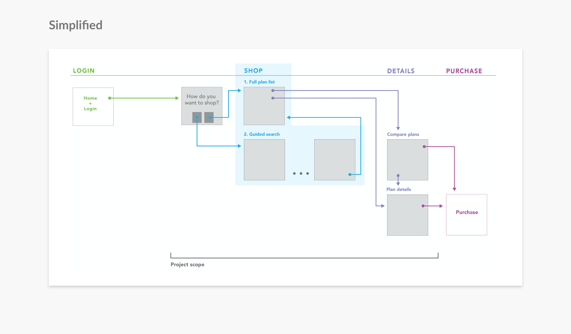
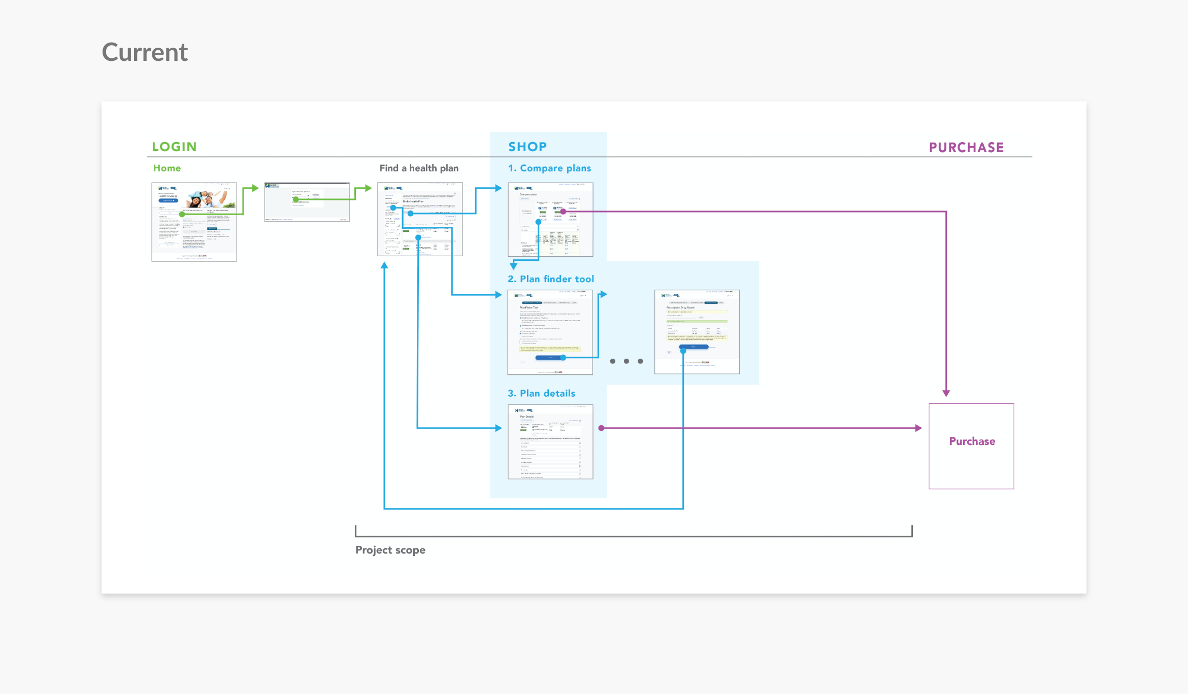
Task flow simplification: In my initial review, one of the first things I noticed was the overly complicated flow. Additionally, users found the plan wizard helpful but expressed frustration that it was buried in with the plan filters. By emphasizing the "Plan Finder Wizard" and moving the "List of Available Plans" to later in the flow, plans are first filtered based on their preferences so a user never sees irrelevant plans. I also streamlined the flow by moving the login to the homepage (instead of its own page) and moving "Compare Plans" and "Individual Plan Details" to later in the process.
Final Design: Key Decisions
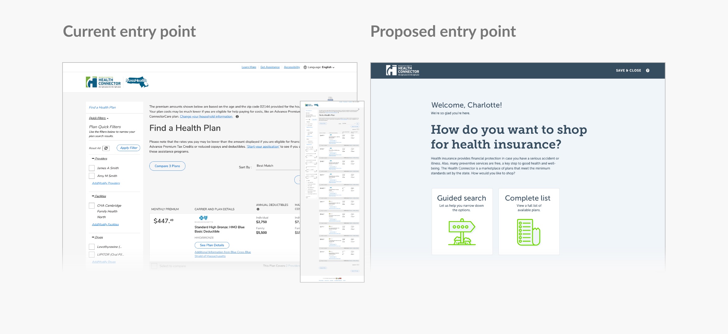
Start With Wizard to Reduce Cognitive Load
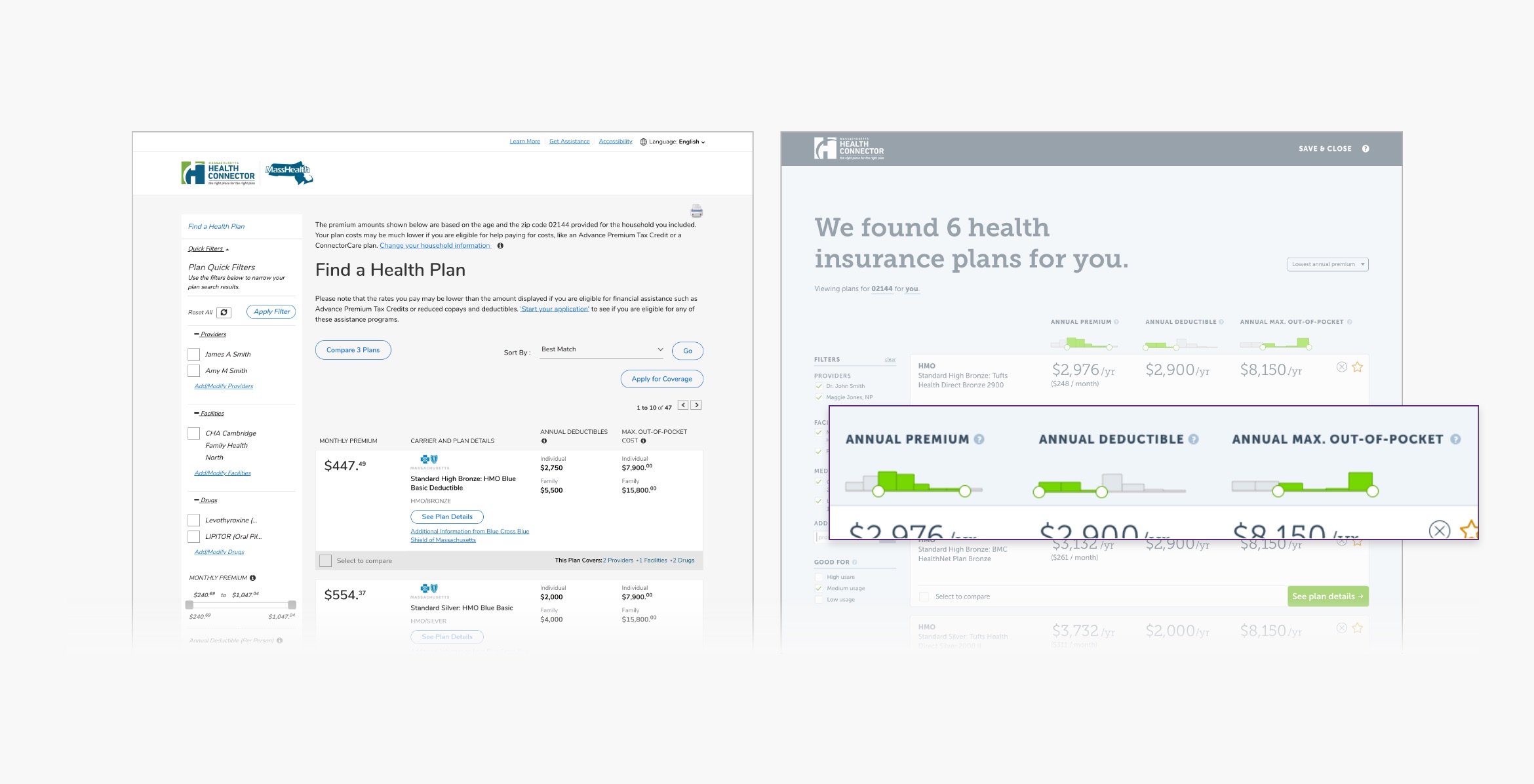
When the user logs in to the current Health Connector site, they are confronted with a list of every plan they're eligible for; most users have 30-50 choices. In my research, I found that too many options decrease likelihood of a user making a decision. And in my user research, subjects had doctors they wanted to keep, and some idea of how much healthcare they typically use. Informed by this, I put more emphasis on the plan filtering wizard by narrowing it to two questions and a single search field in which to input providers, facilities and medications that they want covered. By adding upfront filtering, instead of 30 choices, the user is presented with only plan options that meet their preference criteria — usually five to seven plans.
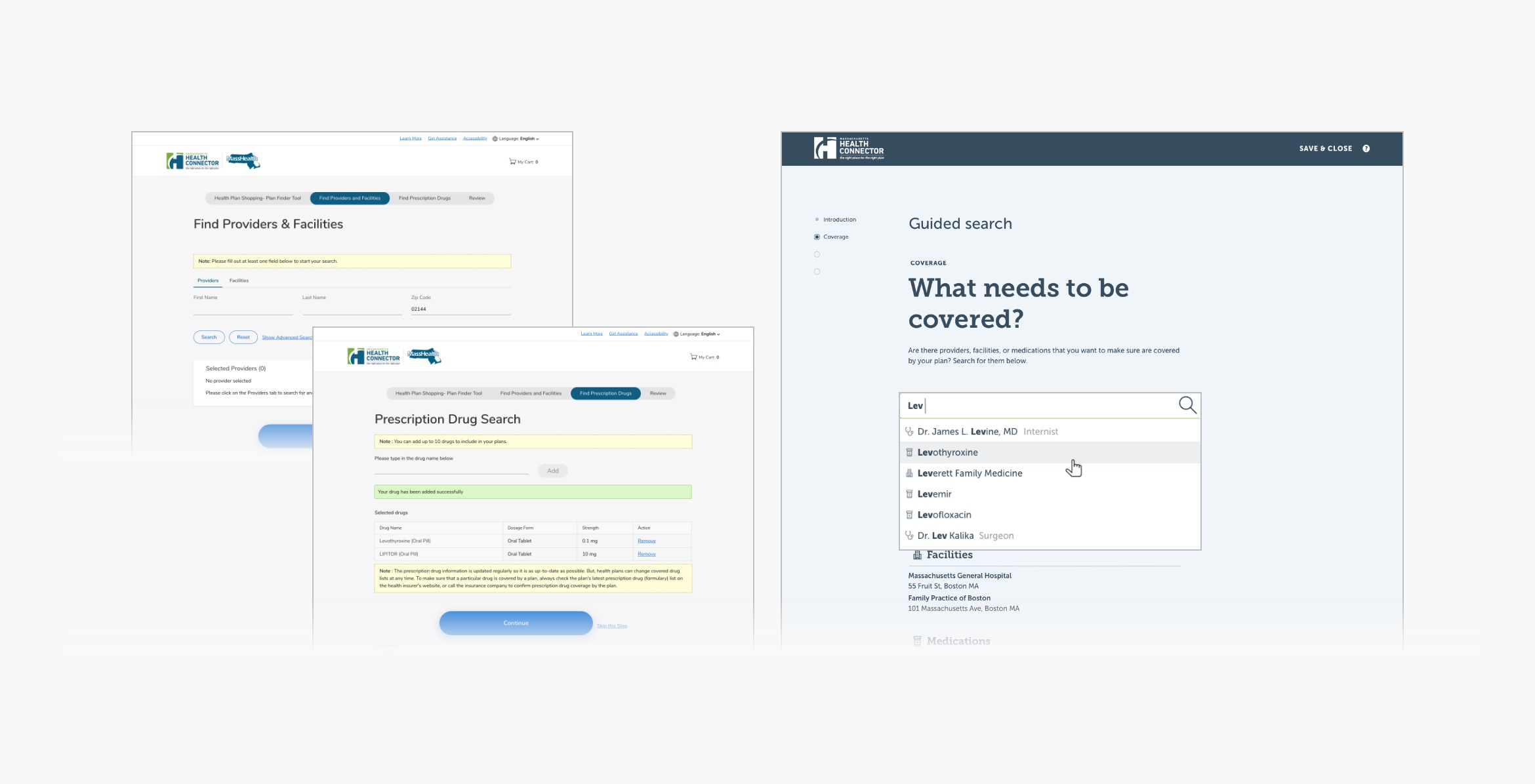
Add More Meaningful Filtering Options
By creating more robust filtering, a user can remove plans that don’t fit their criteria or budget, which promotes decision making. Within the plan finder wizard, I combined multiple screens and form fields into a single field that searches providers, medications, and facilities.
Inspired by the filtering interaction on kayak.com, a travel booking site, I incorporated interactive price filters. Instead or sorting by low or high price, I created interactive bar charts that allow a user to narrow dollar amounts and show how many plans are in a price bracket.
Add Education and Definitions
I also found through my research that users were familiar with many common insurance terms, though not their precise meaning. With that in mind, I added plain language definitions to unfamiliar terms, removed extraneous text, and completely rewrote many sections for clarity and tone.
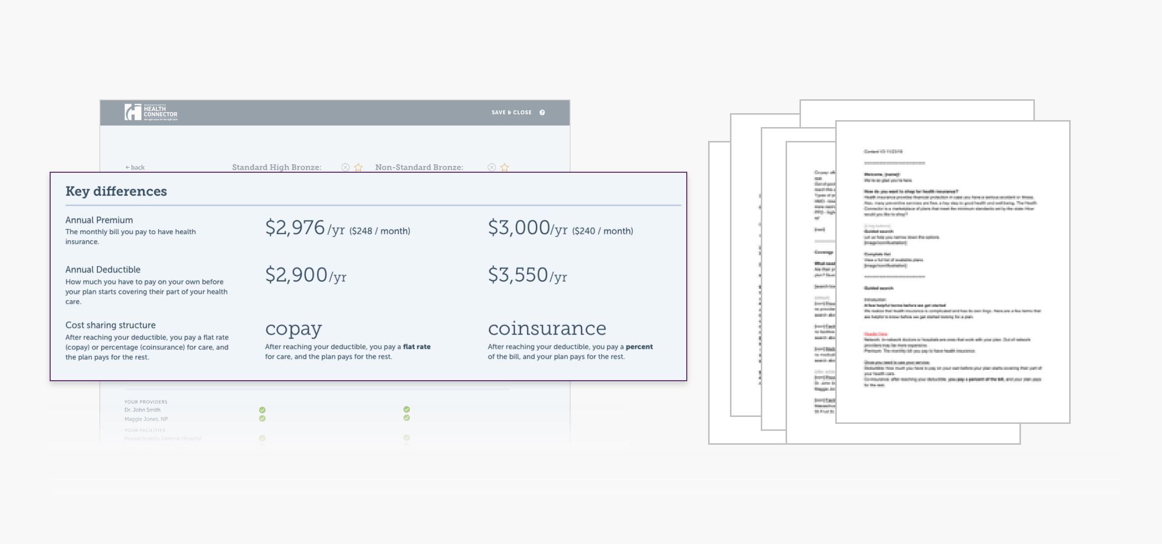
I also added a graphic to explain cost sharing, and where space was tight, I added definitions behind a question circle.
Next Steps & Reflection
Both academic research and the initial user research were invaluable to this project. While usability testing wasn't part of the assignment, I plan to test my hypothesis. So often with usability testing, I've seen that users say one thing and then do another.
This was an exciting challenge to bring information simplification and hierarchy to a complex and meaningful domain.
References
Iyengar, S., Huberman, G., & Jiang, G. (2005). How much choice is too much? Contributions to 401(k) retirement plans. Pension Design and Structure: New Lessons from Behavioral Finance, 83 (June). https://doi.org/10.1093/0199273391.003.0005
Paez, K. A., & Mallery, C. J. (2014). A little knowledge is a risky thing: Wide gap in what people think they know about health insurance and what they actually know. American Institutes for Research, (October), 1–6. Retrieved from http://www.air.org/sites/default/files/Health Insurance Literacy brief_Oct 2014_amended.pdf
Paez, K. A., Mallery, C. J., Noel, H., Pugliese, C., McSorley, V. E., Lucado, J. L., & Ganachari, D. (2014). Development of the health insurance literacy measure (HILM): Conceptualizing and measuring consumer ability to choose and use private health insurance. Journal of Health Communication, 19, 225–239. https://doi.org/10.1080/10810730.2014.936568
Icon credits
Illustrations on welcome page:
Guide by Eucalyp from the Noun Project
List by Wahyu Unggul Sejati from the Noun Project
Icons on the doctor, provider and facility search page:
Medicine by Joyce Lau from the Noun Project
Doctor by Manali Chitalia from the Noun Project
Building by Fauzan Adiima from the Noun Project
More projects

Remote Court Proceedings ExperienceField Research & Service Design
Mapping the Workers' Compensation JourneyJourney Mapping

Penzeys Spices Information Architecture RedesignInformation Architecture
Mass.gov/courts Usability StudyUsability Testing
It's Our Call Interaction Design
Boston CreatesBrand Strategy & Design

4th Avenue, BrooklynPlace Making & Enviormental Design
Williams College Capital CampaignDigital Strategy & Design
TrusteesBrand Strategy & Design
Collective GoodsBrand Strategy & Design

Roasting PlantBrand Strategy & Design

Boston Architectural College, ScreenDigital Strategy & Design

Boston Architectural College, PrintBrand Strategy & Design

WindhoverPrint Design
© 2021 Rebecca Mayfield. All rights reserved.