It's Our Call
From 2017 to 2019, I was co-lead and primary designer of a team that built a site to aggregate legislators’ stances on issues. The goal was to provide activists with real-time stance information, allowing them to prioritize their time and actions. We started with aggregating information received when users call their legislators and hoped to gather stances from social media and news sources.
When the political winds shifted, we closed the project, but this experience was pivotal to my current career trajectory in user experience design.
Problem
In real-time, how is my legislator planning to vote on the Pigeon Recognition Act? If they’re committed to a side, who should I call instead? If they aren’t committed, is the issue close enough that it’s worth my time to call? While there are many sites that track past votes, surprisingly, there’s no Wikipedia for how legislators plan to vote. Currently, this information is scattered across the internet, from social media to news articles and legislators’ websites.
My Role
Project co-lead, user researcher, UX designer, UI designer
Methods
Information architecture, user research, domain research, prototyping
Client
Self-directed
Team
Co-lead: Stacey; other contribuitors: Jesse, Nina, Sean, Danielle, Mason, Ethan, Daniel, Janet, Gile, Carson, Andrew, Eugene, and Ivan
Solution
It’s Our Call aggregates how legislators are planning to vote on an issue, creating a real-time, public whip count.
Process
Initial Research and Proof of Concept
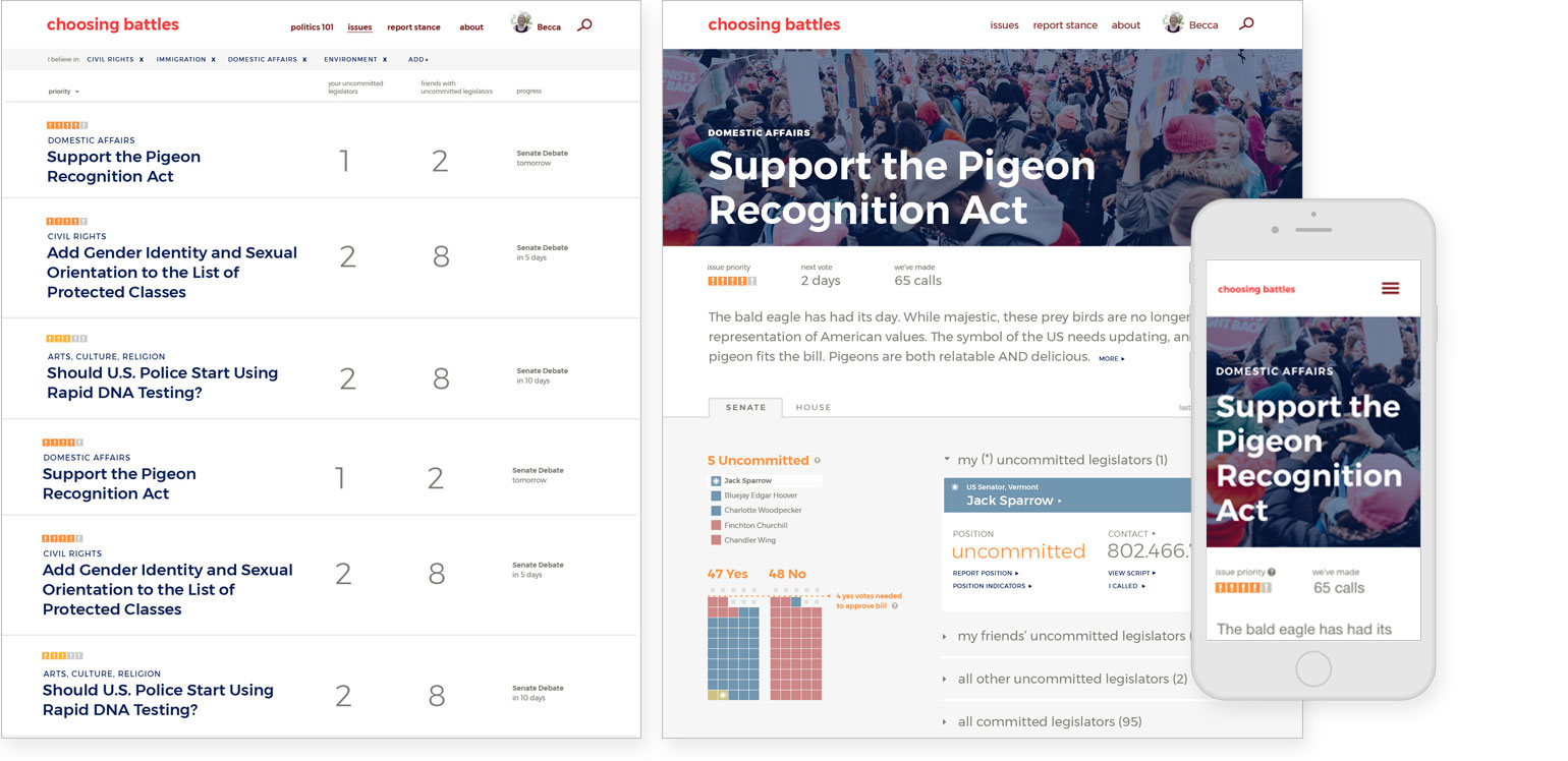
We conducted an initial round of one-on-one interviews to understand what motivates someone to call their legislator, how they currently go about it, what their pain points are, and what features they would expect from our platform. In recruiting interviewees, we explicitly filtered for people who were interested in calling their legislator. Below are the proof-of-concept screens I created for this round of testing. Key takeaways from our initial research included: users want to see their uncommitted legislators on a map, most people call on the go, and “yes, I would definitely use this if it existed.”
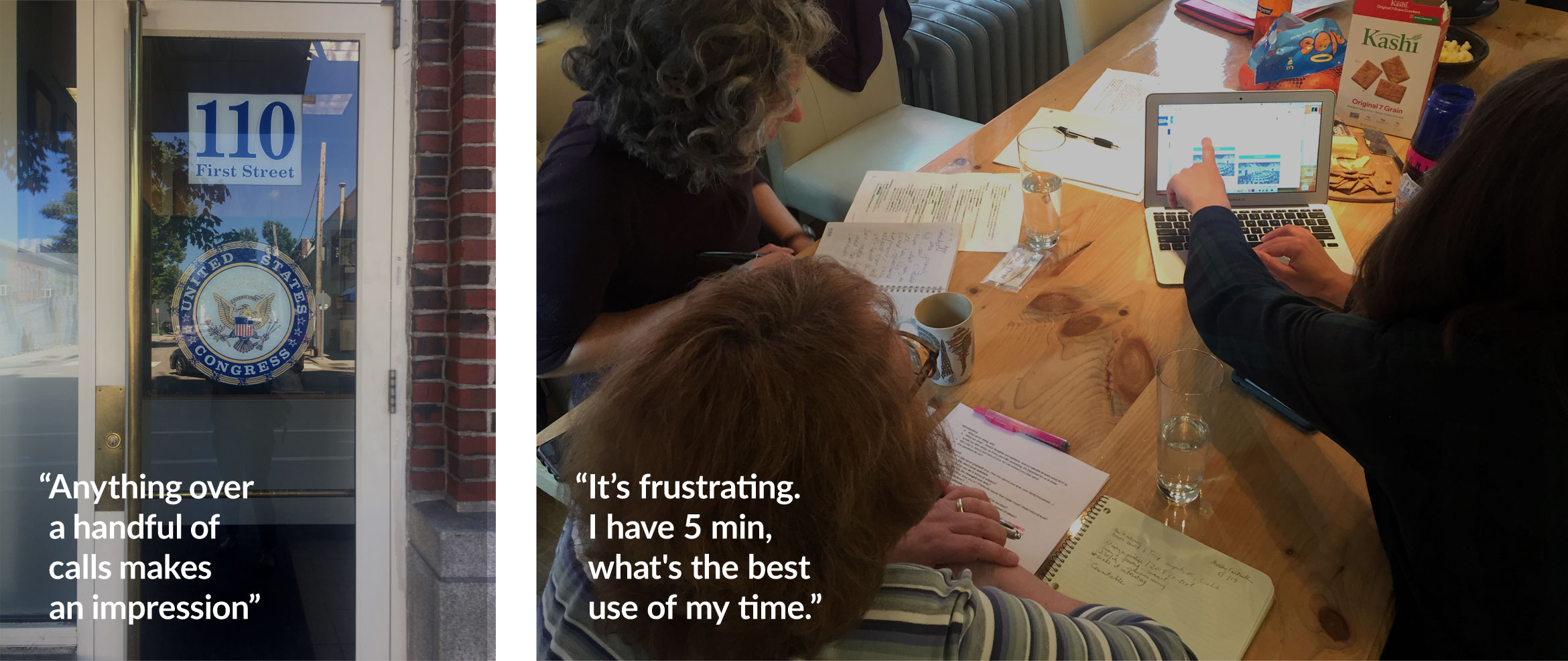
In parallel, we also interviewed several experts, including lobbyists, congressional staffers, and advocacy organization staffers to understand where their legislator stance information comes from and what tools they currently use. We learned a lot about how the legislative process works, including that there are typically only one to two hot issues a week. Some reported tracking this type of information on a whiteboard and confirmed that calling your legislator is effective in shaping their priorities.
Sitemap
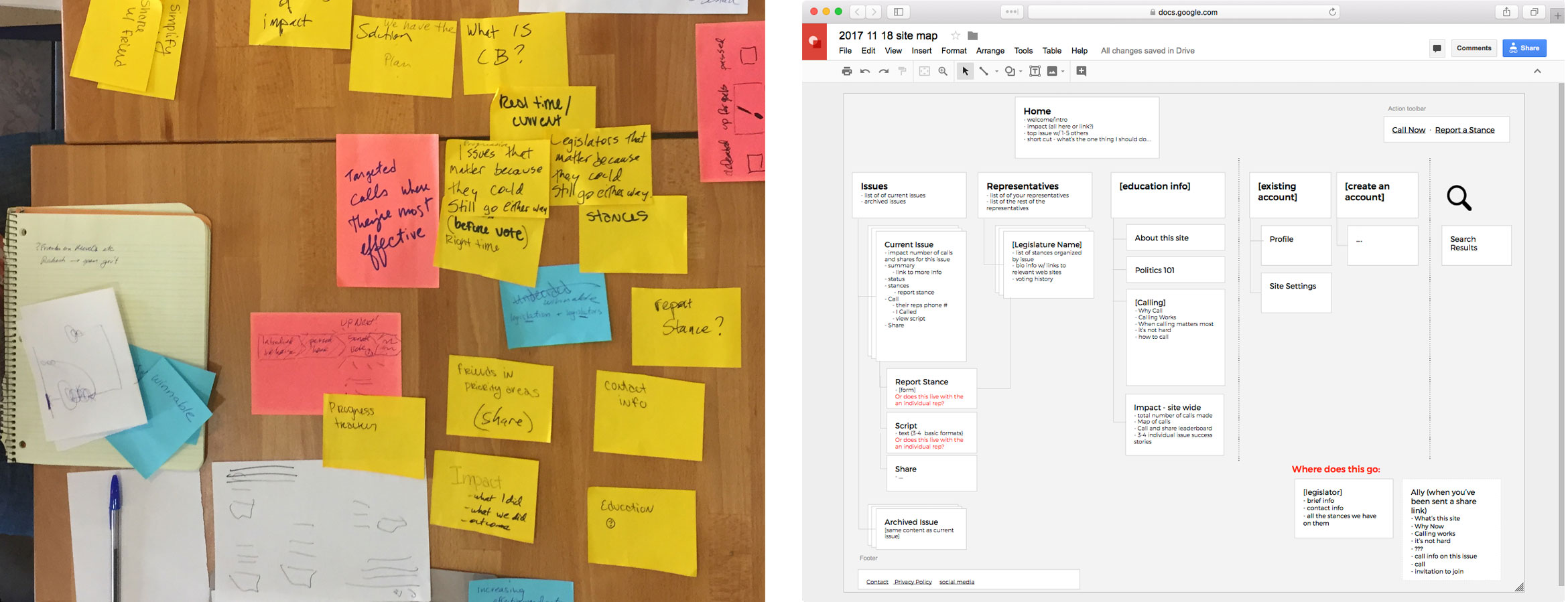
We started out creating a sitemap on sticky notes as a group, and then I refined and expanded map over the next several months.
Wireframes and User Flow Mapping
Wireframe, test, design, test. Rinse and repeat. From our initial research and further scope refinement, we focused testing on the core functionality.
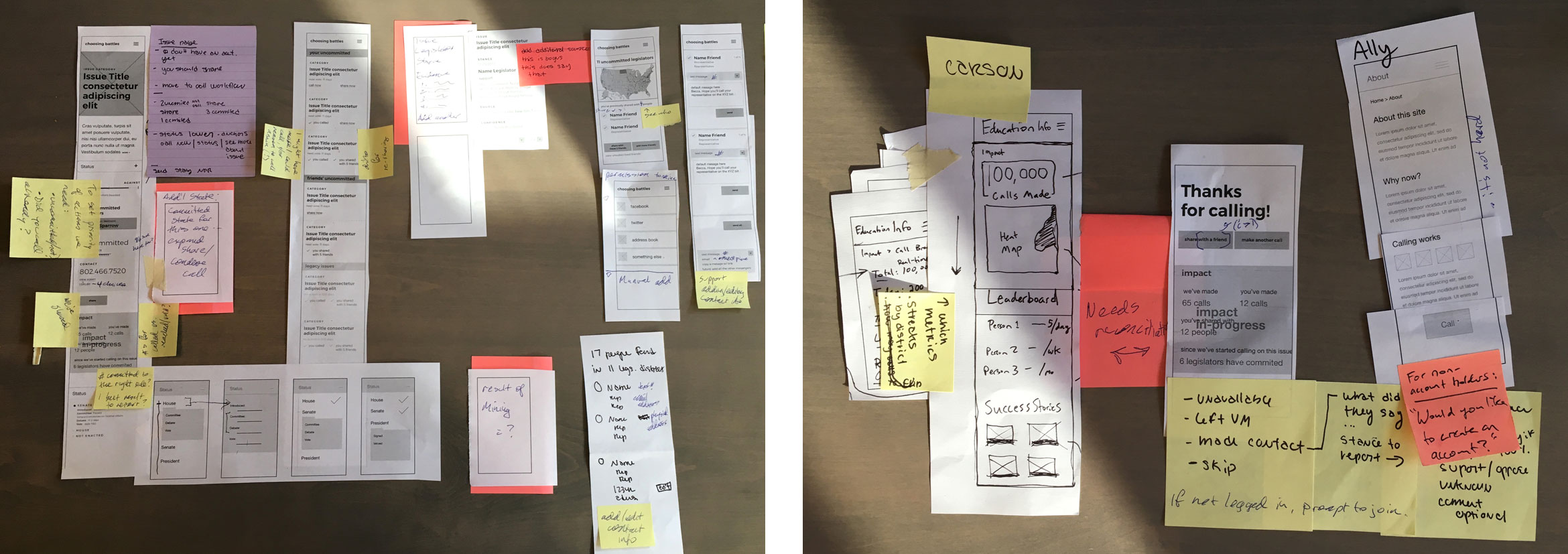
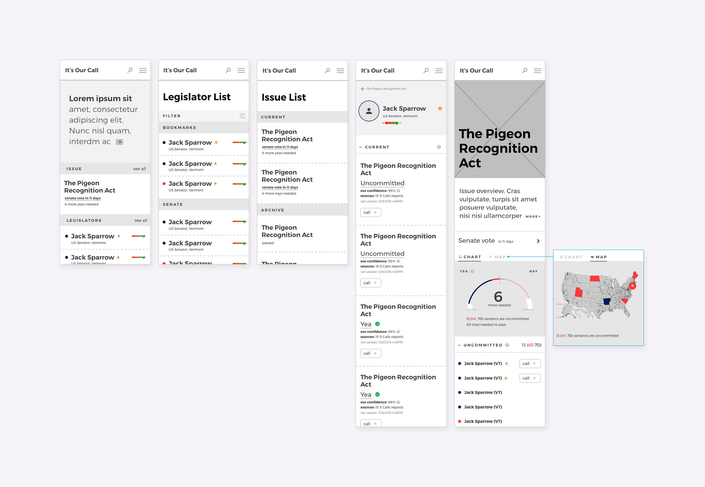
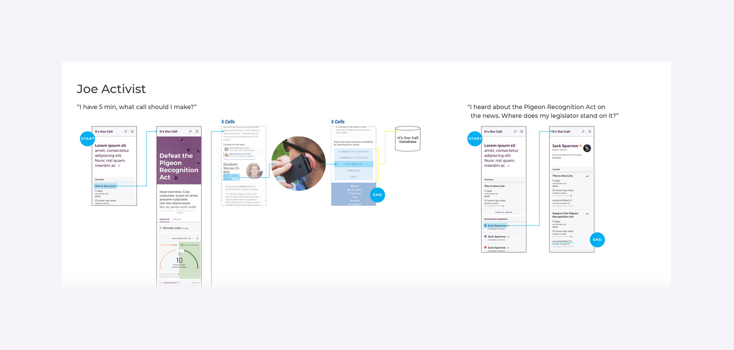
Simultaneous with our mapping activities, we reached out to several established activist platforms, and one agreed to partner with us. With this agreement, we were able to cut back our scope and focus on a MVP (minimum viable product) for our primary user, the activist. Since both platforms are fighting the good fight, it’s counterproductive to duplicate efforts.
Design Development
A selection of stance chart iterations.
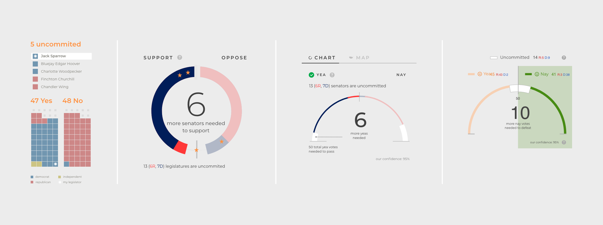
Based on user feedback, we found that the amount of information I initially embedded in the chart design was too much. For example, party affiliation proved to just confuse users and distract from the progressive stance. After a lot of sketching and brainstorming, I figured out that a semicircle chart translated across screen sizes and conveyed the primary information more successfully than bars and full circle charts. Also, users expected the “finish line” in the center rather than the left and right arms, although this meant sacrificing (a little) data accuracy.
Final (for now) Design
The application is fully responsive, though we focused on the mobile layout as our primary audiences make calls on the go. A selection of screens are below.
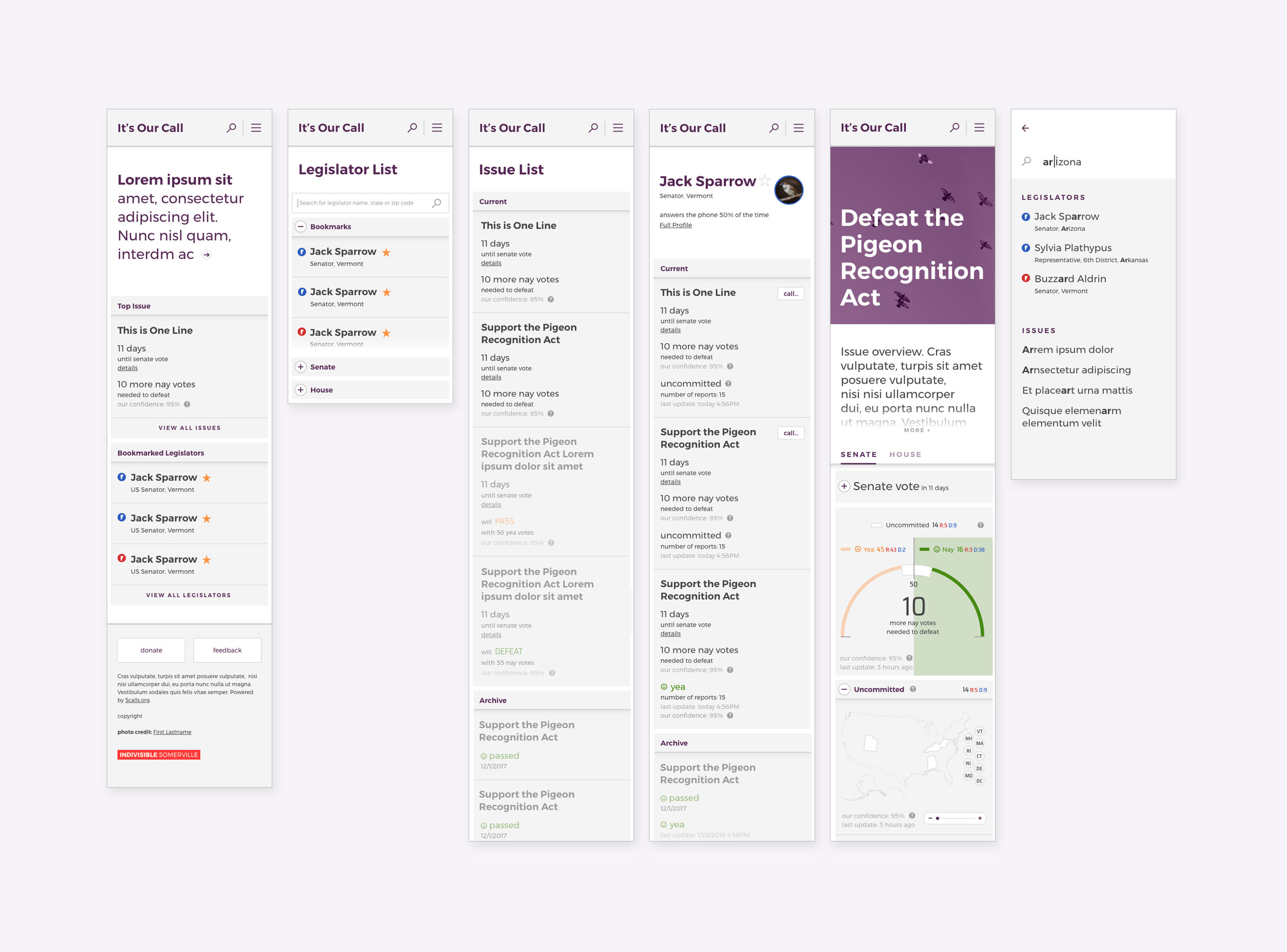
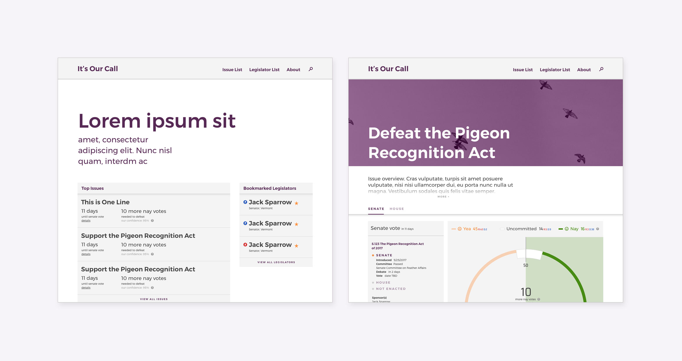
A selection of stance chart states

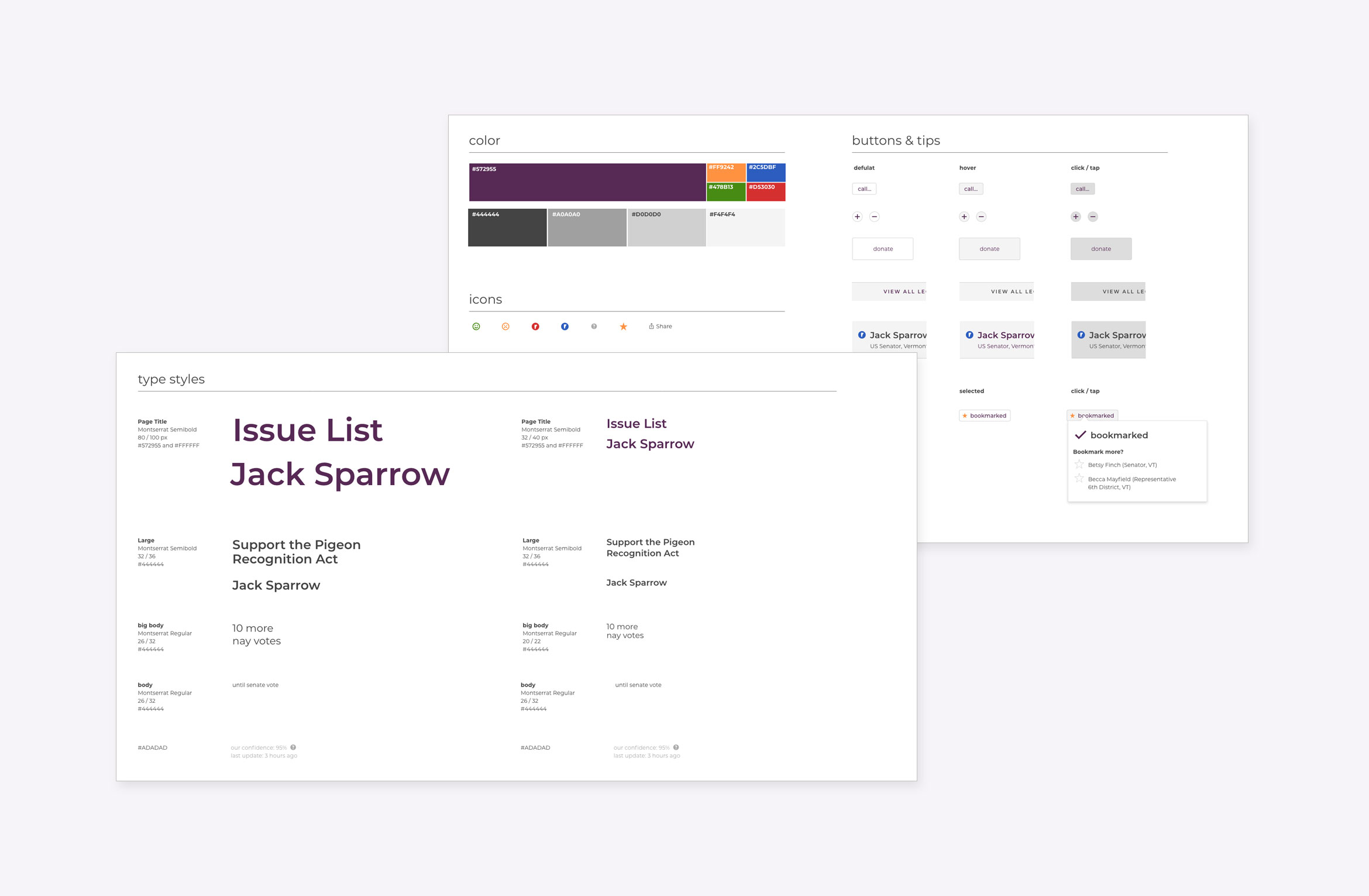
Design Handoff and Components
Because the project team is all volunteer and developers are coming off and on the project as they have time, documentation is critical to facilitating efficient development.
Next Steps & Reflection
We ended the project when the political winds shifted away from calling your representatives. If you have interest in picking up our work or using our research for your project, don't hesitate to reach out.
The two years I spent on the project were a growing and learning experience for me as I translate my experience in graphic design and branding to a UX process. Just as a research driven brand process relies on in-depth research to distill the emotional core of an organization, a user-centered product development approach puts people and their experience as the linchpin. I relish the opportunity to simplify complex ideas and create flexible design systems. Finding an outlet for my skills beyond showing up at a rally and writing postcards has been rewarding beyond words.
Also, I’d be remiss if I didn’t thank my co-lead, Stacey. Without her patience, diligence, and support, this project wouldn’t have existed. I couldn't have asked for a better partner on this project.
More projects
Massachusetts Health Connector Redesign Interaction Design

Remote Court Proceedings ExperienceField Research & Service Design
Mapping the Workers' Compensation JourneyJourney Mapping

Penzeys Spices Information Architecture RedesignInformation Architecture
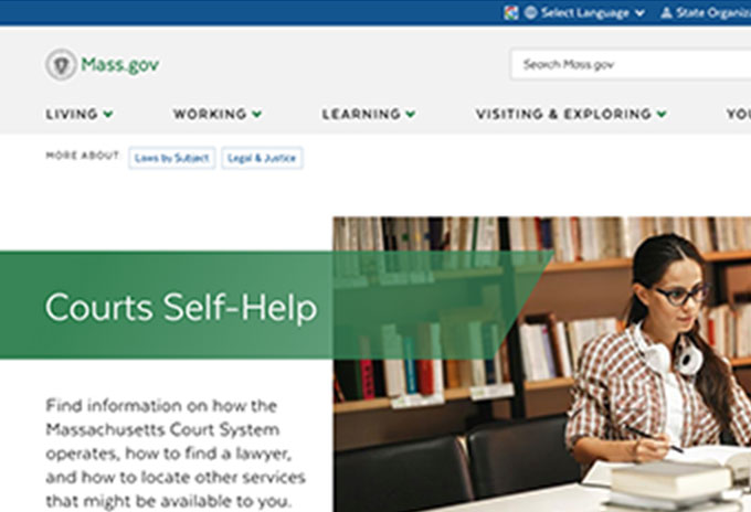
Mass.gov/courts Usability StudyUsability Testing
Boston CreatesBrand Strategy & Design
4th Avenue, BrooklynPlace Making & Enviormental Design

Williams College Capital CampaignDigital Strategy & Design

TrusteesBrand Strategy & Design
Collective GoodsBrand Strategy & Design

Roasting PlantBrand Strategy & Design

Boston Architectural College, ScreenDigital Strategy & Design

Boston Architectural College, PrintBrand Strategy & Design
WindhoverPrint Design
© 2021 Rebecca Mayfield. All rights reserved.